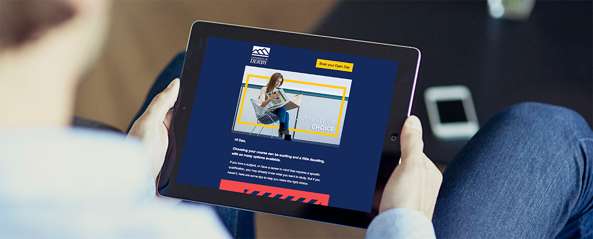
Email marketing is a widely used and a highly effective communication tool for reaching people quickly. But, in such a crowded market place, where the average officer worker receives 121 emails per day [Lifewire] – and with nearly 50% of that being classed as spam – how do you stand out?
Well, it’s tough to do! When you’re sending out mass emails, gaining an open rate of 21.81% and a click through rate of 2.43% is a good average to achieve [Mailchimp]. But what can you do bump those numbers up?
Here are my top tips:
Subject line
If your subject line isn’t informative, you most likely won’t entice people to open it. It’s like opening a new shop without signs – the customers won’t see what is on offer and will walk on by. It’s the same for emails. It’s your first opportunity to grab their attention so try personalising the subject line with names and any other relevant information you have in your Customer-relationship management system (CRM).
Try explaining what the email is about too:
Hey Daniel, Still interested in Education courses? Visit our Open Day on the 19 January.
Personalisation
Once the user has opened the email, you need to display relevant content. Personalisation is key to keeping the users interested, so one simple tip is to try to include the persons name within the first paragraph.
If you have a CRM system which is linked to your email marketing system, you’re likely to be able to pass key details about the target customer to the system, enabling you to create an email that is entirely tailored to them. Using Segments you can build one email which contains all types of content yet, when it gets delivered, it will only show the end user content relevant to them.
So, if User A likes Cats and User B likes Dogs, then both users will get the email at the same time but one email will contain details and images about cats and the other one about dogs.
Call to action
I recently attended a user-experience course and the biggest take away I gained – and started to implement in my emails – is to make the Call-To-Action button one colour and, importantly, a colour that doesn’t really feature on the email anywhere else. So, in this example, the main body is blue, text white and all buttons are yellow. This helps the customer quickly distinguish that the yellow colour indicates an action is required.

Use GIFs
So, how else do you stand out from the crowd? Well, when we can, we use GIFs to add an extra impact. They have exploded onto the scene in recent years and are seen as an everyday feature across all social media platforms.
GIFs are framed animations, made from video clips or static images and they usually last a maximum of 8 seconds – any longer and the file size will just become too large to send via email.

When used on email, they ‘play’ on every email client platform, except the desktop version of Outlook where it displays a static image of the GIF’s first frame instead.
The below links show what can be done with GIFs, from complex simple movement such as a clock ticking/eyes blinking, to complex movie-like scenes:
Standard Communication template
However its important to know, even if you have nailed all of the above, if your database of contacts is not good or out of date, the results will never match your expectations for the campaign, so regular database cleansing is a must.
If you have any questions, please feel free to contact us or book a slot at one of our drop-in sessions which are regularly advertised in Inform. You can do both by emailing digitalsupport@derby.ac.uk.

