Why websites and content have to work on a mobile device

As of October 2018, there were 4.1 billion active internet users in the world, of which 3.9 billion were mobile internet users. Just to clarify, 95% of people who access the internet are doing it using a mobile device.

Browsing habits have changed considerably over the last few years – we idly browse on our phones while watching TV, rarely do we pull up a chair to our computer and settle down to ‘surf the net’. So we have to consider the variety of devices and screen sizes that our audience are using.

The rising tide of mobile use

It’s no surprise that mobile use is increasing when we consider the convenience they offer and the evolution of connectivity technologies over the last few years.

The Office for National Statistics (ONS) releases periodic data which suggests that mobile devices are the go-to devices for all age groups in Great Britain, with the exception of the 65+ age group in Great Britain.

Devices used to access the internet

And this plays out with https://www.derby.ac.uk as well. Year on year, our website is seeing a growing proportion of mobile users, and declining desktop usage.

Designing websites for a range of devices

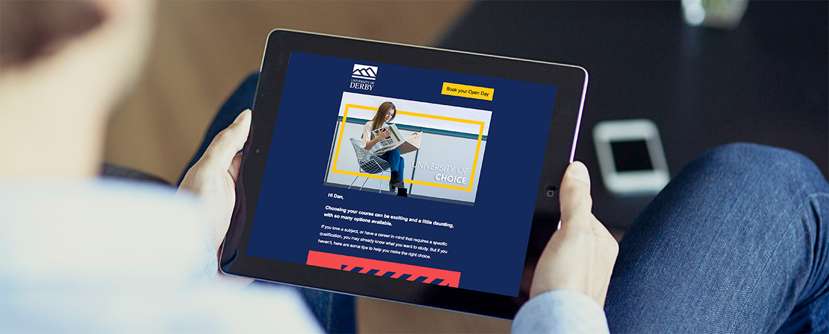
Our new website has been designed with mobile use at the forefront of the development process, it is what is known as ‘responsive’ which means that it adapts the content to fit user device sizes and orientation. This approach allows us to deliver a more consistent user experience irrespective of the device they are using.

What we have seen over time is that users want to be able to explore websites and consume the content irrespective of the device they are using. They want this consistent user experience. But this isn’t the only consideration that has to be taken into account.

Eliminate clutter

Mobile devices have a more restrictive view-port which means that unnecessary elements become a hindrance to the user and will negatively impact the user experience. Websites with a clean user interface will result in users feeling more comfortable in browsing our website and will take on board more of the content that they see.

Mobile interaction is different

With a laptop, you use the ultra-precise mouse to interact with the device, with mobile you rely on a less precise pointing device – your finger! In practice, this means that there is no benefit in creating hover effects on links, buttons need to be large enough for our audience to use effectively and menus are best offered in an expandable format to ensure they don’t take over the valuable screen real estate.

Photography

Clear photography becomes more important with mobile users. An image may look perfectly clear on a desktop device but, on mobile, some images can be difficult to see so use of imagery should be carefully considered.

All of these things have been taken into account on the new website and we are continuing to work closely with many teams to ensure that new content continues to be developed with this in mind.

And this approach is having a positive impact

Our previous website had mobile pages, however they weren’t as optimised as they are on the new site – where we have rebuilt the site from the ground up. To pick out a few statistics:

  • Bounce rates (which measure users who leave the site after viewing one page) for users on mobile devices have improved by 20%.
  • We have seen a 7% increase in undergraduate prospectus requests and a 41% increase in postgraduate prospectus requests from mobile devices.
  • We have had a 4% increase in open event bookings from mobile devices.

We are seeing other interesting trends on an international basis as well. We have seen a 270% increase in mobile users in India and a 42% increase in mobile users in Asia in general.

Why we are looking for Gold Standard case studies – and how to create them

Content marketing is the new rock ’n’ roll. Possibly. You’d probably have to speak to a marketing expert to confirm this.

What is certain is that creating engaging, compelling content about our students, our graduates, our researchers, our business partners, our university is hugely important. It consolidates and builds on our reputation, our profile.

This is why we are working on a series of case studies. We want these stories to be interesting to prospective students but also to current students, parents, business, the wider world. People who will share the story.

More than interesting

In fact, we want them to be more than interesting. We want to make it difficult for people not to read them. We are looking for a Gold Standard in our case studies.

This means giving them the best title, the best images, the best introduction. And we want to keep people on these pages so they can see all the great things we are doing, get to see all the links and promo blocks we have put in for them. But also so they get to know us, get to understand what we do, what we are good at. Get to like us, to respect us. And, if they do, they may well tell their friends about us. Share us. Spread the word.

Something I prepared earlier

We started this process by publishing a small handful of case studies. These case studies have a specific focus but also have a broad appeal.

For instance, our Business Studies case study is about a TV show that everybody watches or has at least heard of. And our Architecture students’ piece is about positive public reaction to their designs for Derby city centre and the Assembly Rooms. We also have a Forensic Science student working in a CSI unit – you know, like on the telly. And Paul Cummins’s poppies that marked the centenary of the First World War. Oh, and a Data Science case study about some research that could turn your laptop into a mini supercomputer. And we have links to these case studies from promo blocks on subject and course pages.

Joining in the fun

Since I first wrote this, our product teams have rolled their sleeves up and produced some excellent case studies. Some are finding it easier than others but there is no doubt that the stories are compelling, such as Gaming student lands dream job with Xbox, The student who redesigned our University and From the office to the ice wall: Dainora’s leap of faith.

And that is the crux of what we are trying to do. Compelling stories. You need an angle, a hook. Something you can pull out and say, in old Sun newspaper lingo: “Hey, Doris, look at this!” It needs to be a story worth telling. Because, if we produce great stories consistently and put them out there, people will keep coming back to us, sharing us. And so it builds

A how-to guide

If you haven’t got to grips with it yet, I have created a case study template. It is full of hints and tips.

These will help you get a handle on what is required for one of these case studies – and give you an idea on how to construct them. But also read the case studies other people have produced. If you rate them, let them know and ask them how they went about it.

Keep using your Q&A forms. Learn which questions work best and share these with your colleagues. Also remember that not every Q&A response will be worth a case study. Recognise that. If you’re not sure about it, try to sell it to the person sitting next to you. And also note that some of the case studies we have created are simply a repurposing of already-existing material from news articles and blogs. So keep your eyes peeled.

What Derby did for us

One thing that all these case studies need is for our students, graduates, business partners to tell us what we have done to help them become amazing. That’s the most important thing we can share, intertwined with the compelling story: how we at the University of Derby have added value to their lives by giving them skills, contacts, opportunities etc. We want people to see this and think: “That could be me.

Remind me why we’re doing this?

We’re doing this because case studies, gold-standard case studies, are a great way to engage with our audience. Take a look at this lovely Twitter-related spike …

And here are some visitors to our Forensic Science course page who may not have got there without our case study …

Some figures

The new approach is measurably better than the old approach. Here are some figures for our newest set of case studies:

Xbox: 100 page views and 4 min average view time (live for one month).

Student redesign: 130 page views and 4.5 min average view time (month and a half).

Ice wall: 16 page views and 3 min average view time (one week).

And here are some more figures which relate to case studies that were on the old site and have been reworked in the new format for the new site.

New site

Ed Hollands: 370 page views, 5 min average view time (five months)

Forensic Science: 350 page views, 3.5 min average view time (four months)

Paul Cummins: 180 page views, 4 min average view time (two months)

Old site

I have taken a snapshot of these figures over a similar period that the case study has been live on the new site – and have also added the total number of page views they received.

Ed Hollands: 107 page views, 3.5 min (total 189)

Forensic Science: 80 page views, 2 min (total 96)

Paul Cummins: 17 page views, 3.5 min (total 71)

And, yes, that last one is why I put Dainora’s ice wall case study figure up. She received almost the same number of views in one week as Paul, the star of the First World War centenary, did in two months. It is clear the new approach to case studies and how they are being used and shared is getting our message out there so much better.

Tips for getting your email opened and for it to be actually read.

Email marketing is a widely used and a highly effective communication tool for reaching people quickly. But, in such a crowded market place, where the average officer worker receives 121 emails per day [Lifewire] – and with nearly 50% of that being classed as spam – how do you stand out?  

Well, it’s tough to do! When you’re sending out mass emails, gaining an open rate of 21.81% and a click through rate of 2.43% is a good average to achieve [Mailchimp]. But what can you do bump those numbers up? 

Here are my top tips: 

Subject line 

If your subject line isn’t informative, you most likely won’t entice people to open it. It’s like opening a new shop without signs – the customers won’t see what is on offer and will walk on by. It’s the same for emails. It’s your first opportunity to grab their attention so try personalising the subject line with names and any other relevant information you have in your Customer-relationship management system (CRM).  

Try explaining what the email is about too: 

Hey Daniel, Still interested in Education courses? Visit our Open Day on the 19 January. 

Personalisation 

Once the user has opened the email, you need to display relevant content. Personalisation is key to keeping the users interested, so one simple tip is to try to include the persons name within the first paragraph.

If you have a CRM system which is linked to your email marketing system, you’re likely to be able to pass key details about the target customer to the system, enabling you to create an email that is entirely tailored to them. Using Segments you can build one email which contains all types of content yet, when it gets delivered, it will only show the end user content relevant to them.

So, if User A likes Cats and User B likes Dogs, then both users will get the email at the same time but one email will contain details and images about cats and the other one about dogs. 

Call to action

I recently attended a user-experience course and the biggest take away I gained – and started to implement in my emails – is to make the Call-To-Action button one colour and, importantly, a colour that doesn’t really feature on the email anywhere else. So, in this example, the main body is blue, text white and all buttons are yellow. This helps the customer quickly distinguish that the yellow colour indicates an action is required.

Use GIFs

So, how else do you stand out from the crowd? Well, when we can, we use GIFs to add an extra impact. They have exploded onto the scene in recent years and are seen as an everyday feature across all social media platforms.

GIFs are framed animations, made from video clips or static images and they usually last a maximum of 8 seconds – any longer and the file size will just become too large to send via email.

When used on email, they ‘play’ on every email client platform, except the desktop version of Outlook where it displays a static image of the GIF’s first frame instead. 

The below links show what can be done with GIFs, from complex simple movement such as a clock ticking/eyes blinking, to complex movie-like scenes: 

Spitfire Event

Festival playlist

Revision playlist

Halloween playlist

Fast Track to Clearing

Standard Communication template

However its important to know, even if you have nailed all of the above, if your database of contacts is not good or out of date, the results will never match your expectations for the campaign, so regular database cleansing is a must. 

If you have any questions, please feel free to contact us or book a slot at one of our drop-in sessions which are regularly advertised in Inform. You can do both by emailing digitalsupport@derby.ac.uk.

How we’re getting our web pages loading faster

People don’t like waiting. They certainly don’t like waiting for web pages to load. This is why we are now using a content delivery network (CDN) that speeds up this process. Here, we look at exactly what this means and how it may affect you. 

What is a content delivery network (CDN)?  

A CDN is a network of servers set up to deliver web-based content faster, particularly assets like images and pdfs that include a lot of data. Delivery is faster because the servers are distributed geographically so there will always be a server close to the user, wherever they may be. This means their images and pdfs will load quicker.  

We are using a CDN from Amazon Web Services (AWS), who also host our website. As well as the CDN, AWS also provide an image manipulation tool that allows us to load different sizes and quality of images to the site depending on what type of device is being used. The system recognises the type of device being used and automatically changes the url. This allows us to introduce responsive imagery across the site, where users on mobile devices will be shown smaller images.  

What are the benefits?  

User experience  

The primary benefit of introducing this technology is it will improve the time it takes to load a webpage. In the digital age we live in, users don’t like to wait, especially the undergraduate demographic. A shorter load time improves user experience particularly for international users. For example, if a user in Australia is using our website, they will be loading images from a server local to them as opposed to having to load images from the UK.   

SEO  

Page speed is a factor in how search engines rank results. Over time, this technology will have a positive impact on our search ranking. Users are more prone to leave a slow-loading website. A CDN can reduce this bounce rate and increase the time that users spend on the site. A faster website should mean people stay and stick around for longer.  

Server space  

We will also save space on our web servers. Normally, when providing responsive imagery when an image is uploaded, we would have to save several different size versions of the image. At a minimum, you’d have a small, medium, large and full-size version of each image. Now, we can store the original image and, when it’s used, the system changes the URL to create different sizes of images on the fly. These images are stored by the image manipulation service and are not on our servers, saving us space.  

As a CMS user, what do you need to know?  

When you use T4, these changes will have no effect on how you upload images and add content. Images should still be uploaded using the specification in our digital guidelines and optimised by passing through TinyJpg.  

There is a small trade-off of using the service in terms of waiting initially for images to be published but I believe the benefits far outweigh this. When web content with a new image is added, it needs to be published to our web server, which is synced with AWS. The sync runs multiple times every hour but it means, when publishing a new image, there could be up to 10 minutes before it is synced and therefore available to use. So the content would be live but the image wouldn’t be there. Ten minutes is the very maximum though. In most cases, it will quicker and sometimes it will be synced immediately. Hopefully, this trade-off will only be temporary. We are working with T4 and AWS on a solution.  

If you have any questions, please feel free to contact us or book a slot at one of our drop-in sessions which are regularly advertised in Inform. You can do both by emailing digitalsupport@derby.ac.uk.

What we can learn from Essex

The Results Day and Clearing period is always an interesting opportunity for marketers in higher education to gain an insight into competitor campaigns. Every year there are shining stars that use inspired tactics, and every year there are those that miss the mark. Usually, if the mark is missed, it impacts solely on the university’s applications rates. This year, well, this year we saw what happens when a university takes aim and misses.

For Clearing 2018, the University of Essex’s tagline was “WE NEED TO TALK”. Never has a tagline been more appropriate as Clearing, for them, descended into questionable territory which had followers deeply divided.
Targeting their campaign to the “bold”, “brave” and “to those who challenge why”, it was inevitable that they were always going to push boundaries, as we all aim to do. After all, if we’re not pushing boundaries then we’re not growing and learning. Starting out on Twitter with pop-culture gifs, they set the bar for the day:

https://twitter.com/Uni_of_Essex/status/1029996280259534849

The use of gifs in social media for HE institutions is one that is heavily debated across the industry, with some considering them a fun and easy way to connect with our ever digitally focused target audience, and others believing the use of them cheapens the University by undermining the intellect and reputation of the institution. In the balanced diet of the digital world, we believe that they fall into the category of “use in moderation”. And, just like you wouldn’t take a takeaway into the Ritz hotel restaurant to eat, you wouldn’t put a gif in the wrong in the wrong conversation on social media.

The trouble for Essex started when their “sassy” gifs changed to “sassy” tweets and then in turn this:

What we can learn from Essex’s mistakes

It instantly split their audience with some praising their “bold” move:

https://twitter.com/thenativetweets/status/1030087567104991233

while others weren’t so enamoured:

It certainly sent shock waves around the social stratosphere, with Essex defending their actions as an attempt to lighten the tension that Clearing usually brings:

https://twitter.com/Uni_of_Essex/status/1030132583517040651

However, many felt they had crossed the line, including the University of Leeds, which came to Leeds Beckett’s defence:

before Beckett responded themselves with “we’re too busy”:

https://twitter.com/leedsbeckett/status/1030089432513359873

It took a few days but news clearly spread in the Essex marketing office and an apology was issued:

Dragging another business into a marketing comparison is something that must be thought about to ensure it is done well. It requires precision, consideration and a level of respect that it seems this tweet failed in delivering. A storm in the teacup of Clearing it may have been – but there are lessons to be learned here.

The first lesson is that publicity stunts like this only work if everyone is on board. Leeds Beckett and the University of Leeds clearly weren’t and did not appreciate the “banter”.

The second is that we need to choose our moment. Clearing is a very tense period for all involved. It’s maybe not the best time to start social media campaigns that emulate keyboard-warrior behaviours. At the very best, a bad post will get ignored and will fall under the radar, wasting nothing but time spent composing the offending message. At the very worst, it will damage the institution’s reputation and make the marketing team look like novices in a field they really should be experts in.

The third lesson is more learned from the involvement of University of Leeds: supporting other universities is paramount. While, yes, the industry is arguably growing more competitive than it ever has been, we must remember that Higher Education is about collaboration. Some of our main competitors are our main supporters and supporting each other adds more value to our own institutions. Undermining other universities will do nothing but reflect badly on your own.

And, finally, it serves as a lasting lesson that marketing a university is very different to marketing a product. As expectations from students grow and the market for applications grows along with those expectations, HE institutions must remember their place. There may be more scope to interact with our students or potential students in a more lighthearted, less formal way to showcase our personality as an institution, but we must remember that the personality needs substance too – and one that shouldn’t be undermined with the wrong style of campaign.

We, as an institution, have a strong set of values that are now clearly outlined in our Strategic Framework and Brand Guidelines. And, while we ourselves are also aiming to be bold and brave, and we are pushing our own boundaries, the frameworks and guidelines are there for us to check back on.

One final note to leave you on: we have spoken to plenty of staff members over the past few months who are making their first steps into the world of social media from a professional point of view and are concerned about things like the above.

There is a lot of worry about “saying the wrong thing” and getting into trouble for what you say. I’ll reiterate what I say to everyone that says this to me: you are experts in your fields, you need to own that. Be proud of your knowledge and understanding, share your opinion and be open to discussions. Providing you keep your opinions and discussions professional then you shouldn’t come into any trouble.

As always, we’re here to help, so if you have any questions around social media, please get in touch on digitalsupport@derby.ac.uk or come along to one of our monthly drop-in sessions which are publicised through Derby Daily.

This blog is about how we can make our website as accessible as possible

Do you understand what this blog is about? If you believe it will give you information about how we can make our website as accessible as possible then the title has done its job.

I have, obviously, over-egged the pudding to make a point [do you all understand that metaphor? If not, it is not accessible]. But the first step on the road to an accessible website is to have a title for each page that tells the reader what they can find on the page. And that continues through the initial content, the subheads, the images, everything. At no point do we want our audience to be wondering what our page is about.

That is the first stage of accessibility. And it is also the first item in our content checklist titled How to achieve AA accessibility rating:

  • Your web page must have a title that describes its topic or purpose

You will be thinking that goes without saying but one of the biggest blockers for accessibility is assumed knowledge.

A short story

Let me tell you a story. A short one.

I put together a list of 15 points specifically relating to content and how to make it accessible. I shared this list with a few people and asked for feedback. I was slightly embarrassed to get replies back saying: “What does this mean?”

Clearly my list wasn’t accessible. Not everybody knows what an “alt tag” is and what it does. I do and had assumed everyone else did as well. The checklist has now been updated with better descriptions. But that doesn’t mean it can’t be improved. All feedback welcomed.

It’s the law

We have an approaching legal requirement to make our website accessible. And we need to achieve an AA accessibility rating. We have put together our content checklist on the Web Content Accessibility Guidelines (WCAG) 2.0. This is what WCAG says about accessibility:

“Following these guidelines will make content accessible to a wider range of people with disabilities, including blindness and low vision, deafness and hearing loss, learning disabilities, cognitive limitations, limited movement, speech disabilities, photosensitivity and combinations of these. Following these guidelines will also often make your web content more usable to users in general.”

computer keyboard

Our checklist

And this is our AA content accessibility checklist:

  • Your web page must have a title that describes its topic or purpose.
  • All images must have “alt tags”. This is a description of the image and can be added in the Media Library in the “Description” field. NB when creating a media gallery, ensure you use a different description for each image.
  • The purpose of each link on the page can be determined from the link text alone. Do not use simply ‘Click here’ or ‘Read more’.
  • Use easy-read alternatives to technically advanced text. Ideally text should be written to be easily readable by all levels of ability.
  • Only play sound if user activates it [unless there is a good reason otherwise].
  • Do not rely solely on shape, size, visual location, orientation or sound for understanding or navigation. Eg avoid content such as “click on the triangular button on the right when the music starts”.
  • Do not change context (eg go to another page, play video) unless this is activated by the user. We want our users’ journey through our website to be as predictable as possible.
  • Provide submit buttons to initiate change of context (eg go to another page, play video) and warn users in advance when opening a new window [opens in new window].
  • Avoid images of text as these cannot be read by screen readers (logos are OK – with the appropriate alt tag).
  • If language changes within the text, mark it in the source code so it is recognised by screen readers. Eg if there is a paragraph in French, use code <p lang=”fr”>Il y a un paragraphe en francais.</p>
  • Information conveyed by colour differences should also be explained in text. For instance, the following four points are technical and will need to be discussed with video/audio providers.
  • Provide a text transcript of audio-only content.
  • Provide captions for all prerecorded audio/video content. Note: captions include subtitles plus text to describe important sounds.
  • Provide a second audio track on all prerecorded video to provide audio description – or a second version of the video with audio description.
  • Provide captions on live audio content.

What’s next?

We are testing our accessibility regularly using the SiteMorse platform and updating our pages where necessary.

We are also taking steps to improve our methods and our content types as we learn more about what is required. For instance, users can now toggle captions on and off on video within the website, and we now have the provision to add text transcripts to video files. We are also investigating the possibility of users being able to toggle to pared down, less visually noisy versions of pages. Every day’s a school day.

A close-up of the YouTube caption button

What we need now is for our content producers to make sure any new content achieves these AA standards.

All new video we upload to the website must have captions and we also want to add a full transcript of what is said in our videos. By the time the law applies to us, we need to make sure EVERY video, new or old, on our website has both of these features. NOTE: We cannot rely on YouTube’s auto captions. They seem to work OK a lot of the time but will then say something jawdroppingly embarrassing. We do not want this. We now have guidance on how to correct subtitles and create transcripts.

Accessibility is a challenge and one we intend to meet well before it becomes a legal requirement. The bigger challenge is to make sure the website is accessible while also being appealing and engaging to all our users.

The new website: 4 weeks in

With the new website being live for 4 weeks  now is the ideal opportunity to dig into the stats to see how things are going. Given the cyclical nature of university recruitment we have compared analytics data for the first weeks of the website going live to the same period last year.

Here’s what we found…

Site wide

Taking on an entire website rebuild was an ambitious target, but it gave us the opportunity to wipe the slate clean. Following the extensive research and discovery phase, we built a new structure focused around user needs. Mapping content into this structure enabled us to identify a large amount of redundant outdated content that could be archived.

The early indications on this approach are promising…

The number of unique page views have increased by 12.5%. This comes despite the new website having under half the number of pages as the old website. In addition, there has been a reduction in bounce rate of 25% and marginal improvements in the time users are spending on the site.

New website mock up

Mobile traffic continues to grow. Last year in the same period 53% of visitors were on desktop with 39% on mobile. We’ve seen this change to 47% on desktop and 46% on mobile. Add in the traffic on tablets and we can see more of our users are accessing the site on handheld devices than desktops.

Search

A key part of the project was implementing a new search solution; Funnelback. Since launch the use of search across the website is up 51%. Looking at the graph below there is an initial spike, which is to be expected with a completely new site, however this has settled down and is now generally tracking above the curve.

Website search analytics

Part of this could be down to improving the visibility of search.

During research it was identified that the core aim for users visiting the website is to a find a course. With this in mind course search occupies the primary real estate on the homepage. There are also separate landing pages for a central, undergraduate and postgraduate course search within the website structure. Bounce rate on search result pages is also down by 15% which indicates that the results being returned are more relevant for users.

Landing pages

Looking at the undergraduate landing page, unique page views are up 45%, but bounce rate has increased from 13% to 23%. Although, as a general rule of thumb, this is still low it is moving in the wrong direction. The story for the postgraduate landing page is very similar.

Digging into heatmaps we’ve had running shows us where users are interacting in the page. Course and subject links have proved to be the most popular across all devices, as shown below in an example segment of one of the maps.

Example heatmap

Across the board the aim is to provide easily navigable content based on what the user wants. We’ll digest these results and look into what tweaks to the content we can make and test over the coming weeks.

What’s next…

More research and more testing!

There have been some promising initial indications but we won’t be resting on our laurels. The stats overwhelmingly reinforce the opinion that course and subject is key for the majority of users on our website. We want to explore the behaviour on course and subject pages to see what users are doing, what kind of content they are engaging with and what they are trying to do. The more we understand that, the better we can help them to get there.

The website has a number of different audiences which reflect in the University’s plans for growth in areas such as online, B2B and research. We’ll be looking into the type of content users in these audiences are looking for. When we have an improved knowledge of this we can plan a new structure and content for these areas.


FAQ’s about the new website

Now that we have reached the exciting time where we are publishing our new website, I wanted to ensure that I answer as many of the questions which we have received throughout the build process.

We will add to these as we get more questions in to the team.

How do I report a problem?

One of the challenges of building a new website, and migrating so much content (29302 at current count), is that there are many intricate pieces that we have to get right. From the page content, internal linking to the redirects file (which contains almost 15,000 records!), there are bound to be some things fall through the cracks.

If you find any, please let us know! The whole team are on hand to squash any bugs that are found as quickly as possible. The best way to do this is email all of the details (and any relevant screenshots) to support@derbyunidigitalteam.atlassian.net.

On to the questions…

Where can I find…

A lot of things will be moving round as part of the new website. To give you a head start, here are some of the things we know you’ll want to find.

Site search

This will be accessible from every page on the website, you will see a spy glass icon on the right at the top of the page, this is where you can start your search from.

UDo, library and Staff areas

Links to UDo, the library and Staff areas are now in the footer (as they were on all mobile responsive pages of the previous site) and this will be the same on every page of the website. You will also find other commonly used links in the footer as well.

Staff profiles

We know staff profiles are very important so they have had a complete structural overhaul. They now use a more intelligent taxonomy so that each member of staff will be linked to relevant subject areas, Research Centre’s, College’s and Departments. This means we can create dynamic staff lists for any area of the organisation and other really cool stuff.

Staff profiles can be accessed by searching for the staff members name and selecting ‘Staff profile’ as the result type. We will shortly be launching a specific staff search page which will give greater visibility.

Staff profile user guides and logins will be setup over the coming weeks.

Why does it look like this?

Before concept work began, an extensive Brand project was undertaken in conjunction with an external agency and the Executive team. The output of this was a new, bolder and more confident brand. This brand project has had some very key influences on the new website which you will begin to see:

    • The line device and use of a box to emphasise particular content – you will see this in use in particular search results and on course pages to emphasis key information.
    • The use of patterns with nine colour variations – where a photograph isn’t needed we can use a variety of patterns and colours in title areas.

We have also spent a significant amount of time and effort on making sure that the foundations of the website follow accessibility standards which we will continue to build on.

Where can i find key areas of the organisation?

Information about the organisation is structured in a similar way to the previous website and can be found using the footer links. This content will be located at https://www.derby.ac.uk/organisation (but not until monday 🙂  )

We now have a much better search functionality, so why not search for what you are looking for?

The search results aren’t what I expected to see

As with any new search appliance, it will take time for the results to be returned in the most optimal order. Please report any issues to our support address at the top of this blog post and we will investigate!

To T4 or not to T4, that is the question 

As the Web Project progresses well into the build phase I thought this would be a good opportunity to check back over one of the biggest decisions made in the process so far; our choice of Content Management System (CMS).

The consideration to change CMS came following a technical workshop undertaken as part of the research phase run by Deeson, the digital agency who are working with us to help us deliver the website. Throughout the tender process Deeson showed confidence in challenging our thoughts and preconceptions. It was for this reason that we chose them as the agency to work on the project, and it proved worthwhile when they emerged from the technical workshop with the suggestion of reviewing our CMS.

The aim of the technical session that they ran was to assess the technology and systems we currently use for the website. Being the platform our website runs on, our CMS, TerminalFour (T4) was at the centre of their focus.

After digesting all of the information that was thrown at them, and after spending a day locked away in a room in South Tower, Deeson came back to us with a number of risks and concerns. These concluded with a number of recommendations, one of which was that we consider switching our CMS provider.

The three key concerns that were raised around continuing to use T4 were the way our site was set up/built, the customer service support offered and the platform’s functionality and stability. The build of the website is down to us; however, the customer service support and functionality are something T4 are responsible for.

Here is how they have been addressed:

Customer service

T4 have recently drastically increased the size of their client support team. This coupled with a new approach to account management from them has seen a vast improvement in customer service and subsequently our working relationship. Issues and queries are both resolved far quicker. We’ve also been working with them to develop and test new functionality.

Platform

The current university website runs on T4 version 7.4. This version has been superseded and is now a legacy system; the user interface is outdated and bugs/quirks are no longer addressed. It has however been replaced by a new shiny version 8.

Some of you may have had a glance at version 8 in a webinar ran last year (if you missed it you can find the recording on YouTube). The main difference for you is a new and improved user interface.

TerminalFour version 8 interface
The new interface in version 8

Key areas of the product have been reworked for example; an improved direct edit feature for easier editing, analytics integration and workflows for content governance.

TerminalFour version 8 Google Analytics dashboard
You’ll now be able to get Google Analytics stats from your content within T4

T4 have also changed the way they operate to work in short sprint cycles. A platform of this scope will be constantly evolving and it will have bugs. But for us their change of approach means more regular product updates, quicker bug fixes and a more stable platform.

Site set up

We have been testing T4 version 8 for a while to fully explore the platform. The most favourable approach would be to rebuild our website in a fresh blank installation. Starting with a clean slate is a much bigger job, however it will give us the benefits of:

  • negating any issues from upgrading
  • setting up the product how we’d like it
  • restructuring the site both externally on the site and internally with T4 based on the extensive research Rob has previously mentioned.

To sum up…

We’re happy that the concerns identified have been addressed. We’ve made the decision to rebuild the website in T4 version 8, a decision that has been ratified by the Web Project Advisory Board.

As a piece of software T4 provides us with a solid base for managing content. But how that takes its form on the public facing website…well that’s down to us. It’s how we build on top of it to develop the functionality we want for an amazing website and T4 gives us the platform to do this.

The crux of it is that a CMS is only one part of what makes a website tick. You can have the best CMS in the world, but it needs to be set up properly, governed consistently and users trained to an appropriate level otherwise it will fall apart.

This will be taken into account during the project, with a fully revamped training programme and a new content governance model. Details of this will be circulated in the coming weeks, watch this space…

What’s going on with social media?

We’re always talking about social media, regardless of whether you use it or not, it is always on the periphery. Recently, however, it has come to the very front of our attention. Between Facebook’s data issue, Snapchat’s controversial update and the emergence of a whole new channel, Vero, it seems that it is firmly in the limelight and is picking up pace. In the ever changing world of social media we’re seeing changes at a more intricate and detailed level.

So, what’s going on?

We’ll start with the most controversial one of all, shall we? The Facebook and Cambridge Analytica scandal was a disaster that many people in the sector were waiting to happen. Facebook’s short sighted and lax approach with data has seen 87 million users have their data improperly shared with and used by a third party without their consent. Cambridge Analytica, a company focused on creating psychological profiles of voters to help its client to win elections, claims to purely be using the data for academic purposes, this is somewhat under question by the majority. Naturally, this has caused Facebook’s share value to plummet and has seen Mark Zukerberg become very publicly vocal about the direction of the company.

This all came at a very bad time for Facebook (if there ever is such a thing as a good time for a colossal data breach) as they have also recently addressed user complaints about their algorithms, breaking away from one that put focus on business accounts and refocusing on showing us content from our ‘Friends’. A strong move for Facebook to make but sadly it has been overshadowed by the breach. So, if you’re seeing more images of your Aunt Margaret’s beloved dog and less from Marks & Sparks, the algorithm is why.

From algorithms to updates

From one floundering channel to another; Snapchat has seen, what is arguably, its most challenging year to date. Since rising to the dizzying heights of nearly 200 million users at the end of 2017 Snapchat started falling short of the mark later in the year, stagnating on the stock market. To help address this issue Snapchat released an update which Snap Inc hoped would see the popularity of the app grow. Unfortunately it was gamble that didn’t pay off and resulted in a whopping $1.3 billion drop in their share value following a tweet from “the Queen of Snapchat”, Kylie Jenner, stating that she was “sooo over” the channel.

Since then there have been more dramas for the channel with Rhianna calling it out for allowing an ad trivialising domestic violence and Chrissy Teigen vocally jumping on the bandwagon leaving Snapchat town. It remains to be seen the long term effect that this will have on the channel; however, it seems that another update is being sent the users way. The response it will receive is hotly anticipated but ultimately the question remains; how many more high profile users will denounce the channel, and will the users follow?

From floundering to soaring

Right now, in the ever changing world social media where one foot wrong sends a channel into a freefall, Instagram seems to be a bit of a star student. Despite an algorithm change last year that took away chronological feeds and replaced them with feeds filled with content based on content it thinks the user wants to see, Instagram keeps going from strength to strength. Outstripping Twitter and Snapchat in terms of monthly users the introduction of (the very Snapchat like feature) ‘Stories’ on Instagram has done nothing but see the popularity of the channel grow. Even an issue with a racist gif on its newly released gif feature was just a flash in the pan of bad news with the feature being taken down almost instantaneously to fix the issue. Of course, it could be put down to the current focus being on other channels that this bit of negativity seems to have flown largely under the radar, but it could also be that Instagram is really targeting what social media audiences want. They have addressed the issue around the algorithm and are in part moving back towards a more chronological feed, a subtle yet effective change that is directly addressing what their audience is calling for. A shrewd move. What we shouldn’t forget at this point, however, is that Instagram is owned by Facebook, so any success Instagram has Facebook has too, and likewise any failings Facebook has should bring Instagram into equal question.

And a new social channel is born

Another slight blip in the world of Instagram came in the form a reasonably ‘new’ social channel: Vero. Dubbed as “the new Instagram” by many it promises social media users something that no other channel can currently promise: an algorithm-free newsfeed. Dubbed “True Social” it was created by Lebanese billionaire, Ayman Hariri, with the focus of becoming an ad free, connection focussed channel that would allow users to get see content they want from the people they want as opposed to what businesses pay for them to see. It is totally ad free and promises a chronological feed – something many social media users are crying out for. It has been around for a while but it recently picked up speed when a number of influential Instagram users announced that they were now using it.

The speed it picked up saw Vero face its first public issue: it crashed. It became so popular – seemingly overnight – that the app became unusable by many, resulting in a large flurry of disgruntled users. With overnight popularity comes the skeletons in the closets and very quickly Vero saw it’s ethics brought into question with some users calling out the all majority male task force (1 in 23 of the named team on their site is female and she features at the bottom of the page) and a quick Google of co-founder Ayman Hariri shows political ties and connections to a business that mistreated migrant workers. It seems that these skeletons may have had an effect on its audience because it seems that the Vero storm took place in a teacup.

In the ever evolving social media sphere this is a channel to watch and it will be very interesting to see if this fledgling channel will grow into something bigger.

And finally, Twitter

Interestingly, all is quiet on the Twitter front. Aside from #TwitterLockout which took place in February and was addressed instantly by Twitter referencing their terms of service as by way of explanation, Twitter hasn’t been in the news at all. Which given the disruption across the rest of the sector is a little surprising. It remains steadfast as a staple for instantaneous news for its users and remains reliable. They say no news is good news but in a market that is moving so quickly and constantly will no news see Twitter fade off? Unlikely. While ever the world looks for its daily fix of Cvofefe Twitter will carry on business as usual.